


What does it take for a growing agricultural company to earn attention beyond the farm? For Bloomfields, it began with CodeThunder Solutions creating a cohesive corporate and product identity designed to inspire confidence among customers, distributors and partners across West Africa.
Website recovery • WordPress rebuilding • Security remediation • Business continuity
Solutions That Fit. Performance That Lasts.
CLIENT
Bloomfields Limited
INDUSTRY
Agriculture & food production
MARKET
Ghana and West Africa
PROJECT
Corporate and package branding
DELIVERABLES
Logo, stationery & brand kit
TIMELINE
To be confirmed
The client
An agricultural company built for regional growth
Bloomfields Limited grows crops and distributes agricultural products within Ghana and to markets across West Africa. As the company prepared to engage a broader network of buyers, distributors and commercial partners, its visual identity needed to communicate the same discipline and quality expected from its products.
The goal was not simply to create an attractive logo. Bloomfields needed a complete, repeatable brand system that could work on formal correspondence, sales materials and large-format product packaging while remaining recognisable across different backgrounds and production contexts.
The challenge
A growing agribusiness can lose credibility when its logo, stationery and packaging feel disconnected. For Bloomfields, inconsistent presentation would make it harder to appear established in conversations with local retailers, regional distributors and international-facing partners.
Create a professional identity that reflects agriculture, growth and dependable quality.
Present Bloomfields as a credible Ghanaian producer with regional market ambitions.
Build a logo system that remains clear across light, dark, green and yellow backgrounds.
Develop corporate stationery for consistent external communication.
Design packaging that identifies the product quickly and supports buyer confidence.
Provide a practical brand kit that keeps future materials visually consistent.
Project goal
The brand objective
Create a modern agribusiness identity that feels proudly Ghanaian, commercially credible and ready to travel – from farms and warehouses to boardrooms, retail channels and distribution markets across West Africa.
The Solution
One identity, built to work across every business touchpoint
1. Brand direction
CodeThunder defined a quality-led visual direction around cultivation, value creation and sustainable growth. The system balanced the warmth of agriculture with the clarity expected of a professionally managed company.
2. Logo and visual identity
The logo combines a growing plant with layered field forms, creating a compact symbol of cultivation and progress. Deep green communicates agriculture, trust and stability; brighter green adds vitality; and golden yellow evokes harvest, value and optimism.
3. Flexible logo variations
Multiple approved colour versions were prepared so the identity would stay legible and consistent on white, green, black and yellow applications.
4. Corporate stationery
A coordinated letterhead and business-card system extended the identity into quotations, introductions, supplier communication and formal business correspondence.
5. Product packaging
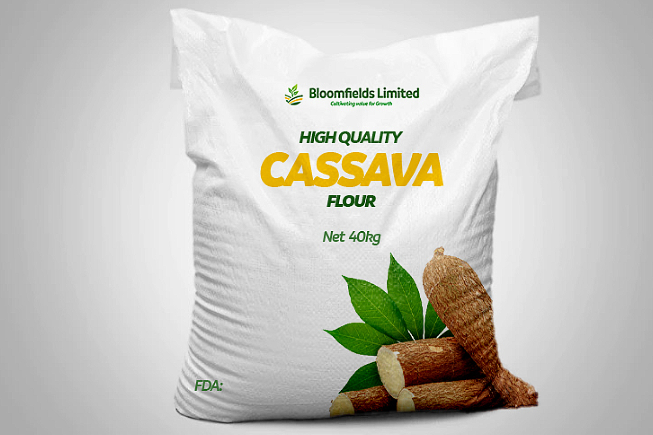
The cassava-flour sack design created a strong product hierarchy: brand first, product name at immediate reading distance, net weight, authentic crop imagery and manufacturer information. Front and back applications were designed as one coherent package.
6. Brand kit
The core colour palette, logo variations, typography direction and application examples were brought together as a reusable foundation for future products, campaigns and market expansion.
The identity system
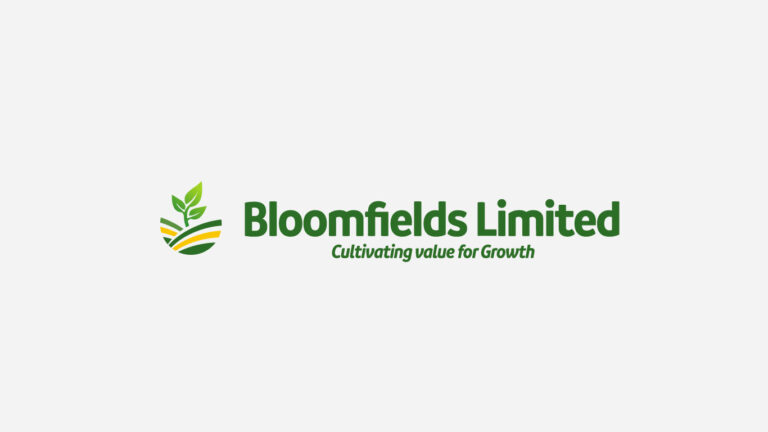
Primary logo on a light background.
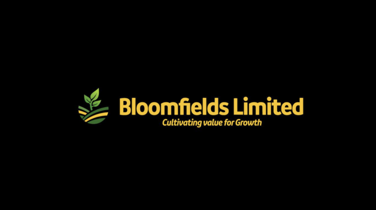
Dark-background variation for high-contrast applications.
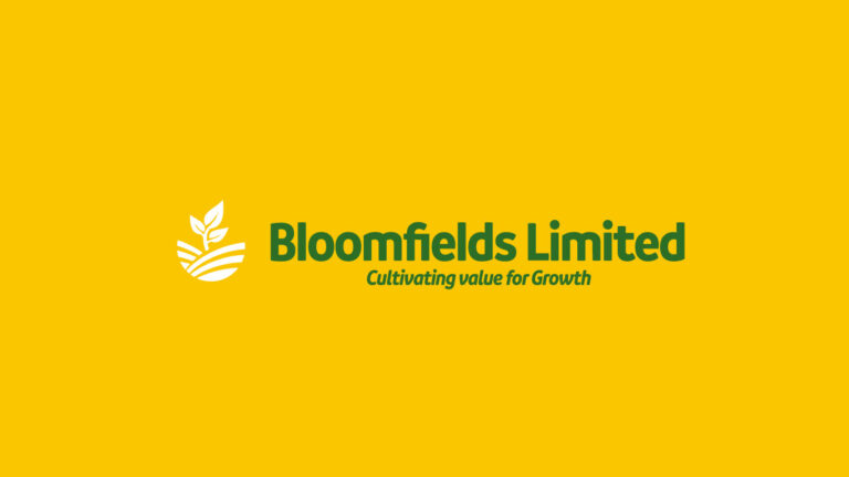
Yellow-background variation preserving recognition and legibility.
Design rationale
- Plant motif: growth, cultivation and the company’s agricultural foundation.
- Field lines: productive land, structure and value created through farming.
- Green palette: freshness, trust, agriculture and long-term growth.
- Golden yellow: harvest, quality, energy and commercial value.
- Bold wordmark: confidence and visibility across corporate and packaging applications.
- Tagline - “Cultivating value for Growth” - connects farming activity with wider business and community progress.
Corporate brand applications
From introductions to formal correspondence
The stationery system gives Bloomfields a consistent professional presence before a meeting begins and after it ends. It supports day-to-day communication while reinforcing the same visual cues used on products and promotional materials.

Business-card application using the green and gold identity system.
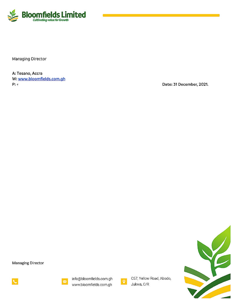
Letterhead application with branded header, contact block and signature area.
Publishing note: the supplied stationery contains personal contact details. Confirm written approval or replace the details with portfolio-safe sample information before placing these images on the public website.
Packaging design
Making quality visible at the point of handling and purchase
For a product sold through distributors and commercial channels, packaging carries both the goods and the reputation of the producer. The cassava-flour sack was designed to remain clear at practical viewing distances while communicating product type, origin and manufacturer identity.
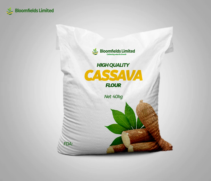
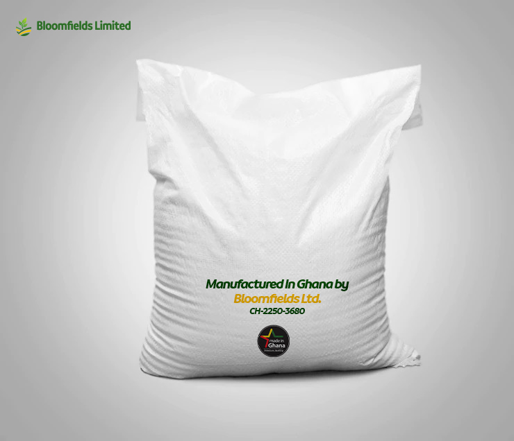
Front: product-led hierarchy and crop imagery. | Back: manufacturer and Ghana-origin information.
Packaging priorities
- Immediate recognition of Bloomfields as the producer.
- Prominent identification of high-quality cassava flour.
- Clear display of the 40 kg net weight.
- Relevant crop imagery to support product recognition.
- Manufacturer and origin details that strengthen accountability.
- A scalable visual foundation for additional crops and packaged products.
The results
The outcome
Bloomfields emerged with a unified identity that can represent the company consistently across corporate communication and product distribution. The project created a stronger foundation for presenting the business to customers, distributors and partners in Ghana and across West Africa.
|
OUTCOME
|
BUSINESS VALUE
|
|---|---|
|
Recognisable identity
|
A distinctive logo and colour system now connect the company’s corporate and product presence.
|
|
Professional credibility
|
Stationery gives formal communication a consistent, business-ready appearance.
|
|
Clear product presentation
|
Packaging makes the producer, product and key information easier to identify.
|
|
Flexible applications
|
Logo variations support light, dark and coloured backgrounds without losing brand recognition.
|
|
Regional readiness
|
The visual system is designed to support conversations with buyers and distributors beyond the local market.
|
|
Scalable foundation
|
The brand kit can guide future product lines, packaging formats and promotional materials.
|
The transformation in one sentence
CodeThunder turned Bloomfields’ agricultural ambition into a cohesive brand system that carries the same promise of quality from corporate correspondence to cassava-flour packaging.
Services delivered
- Brand strategy and creative direction
- Logo design and colour variations
- Corporate identity development
- Letterhead design
- Business-card design
- Cassava-flour package branding
- Front and back sack-label design
- Colour and typography system
- Brand application guidance
- Reusable branding kit
Client Testimonial

Bloomfields Limited
“CodeThunder gave Bloomfields a clear and professional identity that reflects the quality of our products and the scale of our ambitions. From our corporate materials to our packaging, the brand now presents us with greater consistency and confidence.”
Ready to build a brand that can travel with your product?
CodeThunder Solutions helps agricultural producers and growing businesses create credible identities, packaging and corporate materials that strengthen recognition in local, regional and international markets.
